Activity 12: Basic Video Processing

Guess what? We’re down to the last activity for the semester 🙂 So it’s now time to apply the different image processing techniques learned from the previous activities in basic video processing. What? image processing on video? Yes! 🙂 You see, a video is the result of a rapid consecutive successions of a set of still images. From a video, the string of images can be extracted using a video-editing software. Once the images are obtained, image processing can be applied in each of the image frames. And since in video we have another dimension which is time, the kinematics of a system can be obtained.

In this activity, a pingpong ball made to  free- fall from a certain height was recorded in a video. The video was captured using a Canon A3000 with a  frame rate of 30 fps (frames per second).  Using the Avidemux program, as advised by Dr. Soriano, the series of still images were extracted from the video. Shown below is a gif image of the kinematic event.

Figure 1. A gif image of  the free-falling motion of a pingpong ball at a certain height.

The ball is orange while its background is white so color image segmentation from the previous activity can be implemented. A patch from the pingpong ball was obtained and shown in figure 2.

Figure 2. Orange patch from the pingpong ball

Upon segmentation, the ball is now a white blob on a black background. The twelve frames in figure 3 shows the balls dropping height to its first bouncing height. From this the coefficient of restitution can b e calculated.


Figure 3 . Segmented image of pingpong ball  on free fall motion

Coefficient of restitution is a fractional value representing the ratio of speeds after and before an impact, taken along the line of the impact. It is described by the equation


where h is the bouncing height and H is the dropping height. Using Image Processing Design (IPD) toolbox in Scilab , the Centroid of the blob was obtained to determine the blob’s location in the image.  Computing for the coefficient of restitution, the dropping height and the first bouncing height were noted. It was found to be  474.6335 and 284.35127, respectively. Evaluating in the equation gives a coefficient value of 0.7740132.

For this activity, I give myself an 8/10 for being able to do the task but then submitting late.

I would like to thank Eloi and Mabel for the help in this activity. ☺

References:

http://en.wikipedia.org/wiki/Coefficient_of_restitution

Activity 11: Color Image Segmentation

Image segmentation can be seen in many applications such as in medical imaging, face recognition, machine vision and many more. Basically, it is a technique of distinguishing objects from the background. It is a process of segmenting pixels and assigning labels on the segments such that the same segments posses the same properties. Image segmentation can be observed in the previous activities.  It was done by adjusting the histogram levels in a grayscale image. But this technique often times cannot be done when the background of an object happens to have the same gray scale value as of the background upon converting the colored image. Color image segmentation on the other hand can be used on a wider range. First, it requires that one select a Region of Interest (ROI) from the image which will be the basis of the selection for segmentation. Then, further image processing is done.

Images of 3-Dimensional objects, depending on the way the image was captured, have different shading variations. This shading variation serves like a gradient of a single color in an object. This is the reason why instead of representing pixels in RGB, it is more convenient to use the Normalized Chromaticity Coordinates (NCC). Compared to RGB color space, the latter is able to give information not just on color but also on its brightness variation. The NCC is done by first taking the intensity per pixel of the image as

I = R + G + B

Then the normalized Chromaticity coordinates are,

r = R / (R+G+B)  =  R / I

g  =  G / I

b  =  B / I

 where

r + g + b = 1;

b = 1 -r – g = 1 – (R/I)  – (G/I)

So the r, g, and b can only have values between 0 and 1. Also, blue can just be represented in terms of red and green reducing the variables to just R, G, and I which are the red, green, and brightness information respectively. This now gives a 2D color space representation shown in figure 1.

Figure 1. 2D Normalized Color Space

So now we try to see how color image segmentation works. Image segmentation has two methods: Parametric and Non-parametric. We will implement both methods and compare the results. We have here an image of monochromatic color (consider the blue color) obtained from the internet. This will be our first image to be tested.

image source: http://menbook.net/580-nicholas-kirkwood-aw-11.html

Figure 2. Image of a 3D object.

Parametric Segmentation

Essentially, an analytic function is fitted in the histogram of the ROI. So for the image in figure 2 the ROI obtained is shown in figure 3.

Figure 3. ROI from the image.

The histrogram of the ROI is obtained and then normalized to get the Probability Distribution Function (PDF) of the color. For a pixel (from the image) to be matched if having the same characteristics as the ROI, the probability distribution of the red and green colors in the image is obtained. A Gaussian probability distribution is used. The probability for r is shown in equation 1

 (1)

where

mu_r, mu_g: mean
sigma_r, sigma_g : standard deviation

All the input values are from the pixel in question. This expression shows the probability of a pixel with chromaticity r belonging to the ROI. To obtain the overall probability, the joint probability p(r)p(g) is obtained, where p(g) is obtained the similarly as p(g).

Figure 4. Resulting image after Parametric segmentation.

Non-Parametric Segmentation

For this technique, Histogram backprojection is used. Here, a pixel location is assigned from its histogram value in chromatic space. This method was done in the previous activities, only this time we have a 2D histogram. It was implemented in Scilab using the code provided in the manual. The histogram is as shown in figure 5.

Figure 5. 2-Dimensional histogram

The resulting image after using histogram backprojection is  shown in figure 6.

Figure 6. Resulting image after non-parametric segmentation (applying histogram backkprojection).

It can be observed that the result of parametric segmentation shows a ‘cleaner’ segmented image than the non-parametric one. ‘Clean’ in terms of the edges separating the object from the background are more defined.

Figure 7. Comparison of the Original image (colored), Parametrically segmented image (top right), and Non-parametrically segmented image (bottom left).

But let’s look at other examples, and see if there are differences. This time we try segment objects with red and green shades. Images used are from archived images in my computer. 🙂

Figure 8. Comparison of the Original image (colored), Parametrically segmented image (top right), and Non-parametrically segmented image (bottom left).

From this two examples, it can be observed that the Non-parametrically segmented image shows a more accurate segmented image. It can be said that to obtain an accurate segmentation, Parametric segmentation works but not always since it depends on the fit of the distribution function assumed. While Non-parametric segmentation is better in general since it doesn’t assume any fit. It directly maps the pixel value to the histogram.

Figure 9. Comparison of the Original image (top), Parametrically segmented image (middle), and Non-parametrically segmented image (bottom).

For this activity, I give myself a 10/10 for being able to generate the required outputs. ^_^

Reference:

[1] M. Soriano, A11 – Color Image Segmentation, 2010.

Activity 10: Applications of Morphological Operations 3 of 3: Looping through images

We have here an image of cut-out circles made of paper. We consider this as an image of ‘cells’. And by that, i mean biological cells. Take this as a simulation. So the goal of this activity is to be able to isolate each ‘cells’ or blob from each other and obtain the areas of each blob and lastly the average of all the areas. From all of that, we will be able to obtain the estimated area of a cell. So let’s start! 🙂
Image

Figure 1. Image simulation of cells using scattered leftovers of punched paper

First, the image is cropped to sub-images of 256×256 dimension (as shown in figure 2) using Photoscape program . I decided to use it because it has a ‘Splitter’ feature where you can crop an image into its sub-images by just specifying the desired dimension. Also the sub-images were named such that the top row images  are C_01, C_02, C_03 continuing to the bottom rightmost image which is C_09.

Figure 2. The 256×256 sub-images from the original image

The sub-images were then binarized using the im2bw() function with its corresponding threshold. Just like in the previous activities, the threshold was determined by obtaining the average gray level from the histogram of the graylevels of the image.

Figure 3. Binarized 256×256 subimages from the original image

Different morphological operations such as  Open and Close operations,were performed for the different sub-images depending on the suited operation to separate the cells from each other. Other were performed with close() operation. But since SIP toolbox is used, the counterpart operation is by dilating first then eroding. It is shown in figure 4.

Image

Figure 4. Close morphological operation of sub-image 05

On the other hand, the open() operation is equivalently done by first eroding an image then dilating the image as shown in figure 5.

Image

Figure 5. Open morphological operation of sub-image 03

As seen in figure 6, some cells were successfully separated while some were not. Nevertheless, it’s still okay since we’ll be obtaining the average area of the blobs with higher number frequency.

Figure 6. The 256×256 sub-images after performing close and/or open operations

The average areas per sub-image was then obtained including its corresponding standard deviation (all in pixel units). The values are as shown in figure 7.

Figure 7. The average areas and standard deviations of the sub-images

From all the obtained values, the average area is found to be 489.93 pixels with 35.5 standard deviation. Note that the sub-images with blobs  having way larger area values were disregarded in calculating the final average values due to high deviation.

Here’s another image containing various ‘cells’ but this time there are outlying abnormally larger cells which we will take as ‘cancer cells’. From the image, our naked eye can distinguish the said outlying cells. The identified ‘cancer cells’ are encircled as shown in figure 7.  Also to directly compare the sizes, stars of the same size were overlaid on two nearby circles. It can be seen that the encircled one is larger than the other (relative to the star).

Figure 8. Image of normal ‘cells’ with ‘cancer cells’. The supposed ‘cancer cells’ were identified and encircles in the image.

So our ROI here are the supposed ‘cancer cells’ and our goal is to be able to isolate them. Let’s see if indeed these identified ‘cells’ are the the ones we’re isolating. First,  the image was binarized using the im2bw() function with its corresponding threshold value. Then different morphological operations were done filter out the normal cells. It was done by making a structural element (strel) having the same size as of the normal cell, so that after eroding the image only the larger ones remain. The image is then dilated using the same strel to reconstruct the ‘cancer cells’ original size. The structural element used is a circle with radius of 13 pixels, the radius approximately equal to that of the normal cells.  Then we obtain the image in figure 8. 😀

 Figure 9. Binarized image with isolated cancer cells after applying morphological operations

Finally, we are able to isolate the ‘cancer cells’. Also, we were able to confirm that indeed the suspected outlying cells were the supposed ‘cancer cells’. 😀

So for this activity I give myself a 10/10 for being able to do the required outputs. 😀

Activity 8: Applications of Morphological Operations 1 of 3: Preprocessing Text

In this activity, we will see an application of some of the morphological operations seen in the previous activity.

A scan of a receipt is shown below:


Figure 1. Scanned reciept: image to be processed

Since the image was slightly tilted to the right, it was rectified using Photoscape software. There is an option in the software to rotate the image by giving an arbitrary rotating angle value, as demonstrated in figure 2.


Figure 2. Rectifying the image using Photoscape software.

Then a portion of the image was obtained by cropping (again using Photoscape). It is shown in figure 3.

Figure 3. Cropped portion of the scanned receipt.

Then using the same process in Activity 6, the lines in the image was removed using enhancement in the frequency domain. This was performed using Scilab program. The image was first converted to gray scale.

Figure 4. Image to be processed. The original cropped image (left) and the grayscale version (right).

Then the Fourier transform (FT) of the image was obtained. From the FT of the image, a mask was made using Paint software. These two are shown in figure 5.

Figure 5. The fourier transform of the cropped image (left) and the generated filter mask (right) made using Paint software

The two images in figure 5 were convolved resulting to an image, say image 2. Then inverse FT of image 2 was obtained. The resulting image is now shown in figure 6 (left). Since using the technique did not completely remove the lines, the image was further edited by converting to black and white using the im2bw() function with a threshold value of 0.4. The threshold value was arbitrarily selected  based on the clearest image produced with the lines removed.

Figure 6. The filtered image (left) and its corresponding black&white-converted image using im2bw()

To make the handwriting one-pixel thick only, the thin() function was used. Just like the other morphological functions erode()  and dilate() used in activity 7, thin() is available in the SIP toolbox but not in the SIVP toolbox. It functions by editing binary images and thinning out the images by border deletion. This is shown in figure 7. An inverted version was also made for comparison.

Figure 7. Comparison of the black&white image (left), the image with one pixel-thin letters (center), and the inverted image of the image at the center.

For this activity, I give myself a 9/10.

Activity 7: Morphological Operations

In image processing, Morphological operations are used to understand the form of an image. It is based on the Mathematical morphology theory. But this activity won’t be dealing much with the mathematical part since we are more concerned with how it is applied in images.

Basically, what we’ll be doing is binary morphology . This is done by having an image, say a shape, then another image which is (another) pre-defined arbitrary shape, which is called a Structural element (s.e.). The s.e. is used to probe the shape and in the process, a conclusion is drawn on how the s.e. fits or misses the shape. To show a clearer image on how it is done we look at the two morphological operations: (1) Erosion and (2) Dilation.

Erosion

It can be described by the mathematical expression.

wherein all points z such that when B is translated in z is contained in A [1]. An example is shown in figure 1. The shape is a 5×5 square (bottom) and the s.e. is a 2×1 (ones) pixel.  A reference pixel from the s.e. was selected shown as the blue area. We also call this as the output pixel for easier demonstration. The rest of the other pixels are taken as surrounding pixels. For erosion, all the surrounding pixels must be 1 for the output pixel to be 1. This function is usually used in eliminating white noise in black background.

Figure 1. Erosion of a 5x5 square  with a 2x1 ones pixel.

Dilation

It can be described by the mathematical expression.

wherein all points z such that when B is translated in z  and is coincided with A will not give an empty set [1]. Dilation is the opposite erosion. As long as any of the surrounding pixels have the value of 1, the output pixel becomes 1. Similarly, it also means that ass long as all the surrounding pixels are black, the output pixel is black.

Figure 2. Dilation of a 5x5 square  with a 2x1 ones pixel.

For more demonstrations (Yay!), we have these shapes that was generated using Microsoft Paint (fig. 3). The grids in paint were relatively small so I decided to use 2×2 square grids as 1 pixel representation. (Note: The minimal size of the grids in the images causes distortion once posted in this blog. You might have to open the image to clearly see it. Also, this was supposed to be hand-drawn in graphing paper as suggested in the activity but to save paper I decided to do it via computer. :P)

Figure 3. Paint-generated shapes

Also, 5 different structural elements were generated: 2×2 square, 2×1 ones, 1×2 ones, 3×3 plus sign, and a diagonal pixel line. Just like what was shown in the first two examples, the reference pixels are highlighted blue.

Figure 4. Paint-generated structural elements

We can say that the method is fairly simple. With that, we can predict the resulting images by eroding and dilating it manually. Eroding the shapes with each of the s.e., the images shown in fig.5 is obtained.

Figure 5. (Paint-generated) Predicted images (bottom) of the different shapes eroded with its corresponding structural elements (top). The original image is shown at the leftmost part.

The s.e. and its corresponding eroded/dilated image are aligned vertically. The original image is also shown (bottom leftmost) for reference/comparison. In figure 5, the blue area of the resulting image, which is is the remaining part of the eroded original image, is now the output image. On the other hand, in figure 6, the blue area + white area of the resulting image comprises the output image. Think of the blue areas as extended pixels of the image.

Figure 6. (Paint-generated) Predicted images (bottom) of the different shapes dilated with its corresponding structural elements (top). The original image is shown at the leftmost part.

Now to confirm if the predicted outputs are right, we simulate using Scilab. I used Scilab 4.1.2 + SIP toolbox for this one since it has the erode() and dilate() functions. First off, we create the shapes and structural elements (again..) but this time using Scilab.

Then using the said functions, the erosion and dilation was done. Some of the code snippets are shown below.

//Erosion
//erosion of 5x5 square by 2x2 square
sq_er = erode(sq, se1);
scf()
imshow(sq_er);

//Dilation
//dilation for 3x4 triangle by 3x3 plus sign
tri_di = dilate(tri, se4);
scf()
imshow(tri_di);

The functions both require two inputs: the binary shape and the binary s.e.. Then voila! we have the eroded/ dilated image, of course with the use of the imshow() function.

For better comparison, the shapes, structural elements and their corresponding eroded and dilated images were show in tabular form.

Figure 7. Scilab-generated eroded shapes with corresponding structural elements

Figures 5 and 6  shows all the resulting images. The rows show the different shapes while the columns are the structural elements and their intersections are the output images.

Figure 8. Scilab-generated dilated shapes with corresponding structural elements

Comparing the predicted images from the resulting images , it can be seen that indeed they are the same! 😀 It can be observed that dilating/eroding the shapes with a certain structural element results to an image that more or less resembles the shape of the said s.e.

From all of this, it can be concluded that generally, eroding an image reduces its shape by making it ‘thinner’ while dilating the image increases the shape by making it ‘thicker’. But the change in shape actually depends on the structural element used. This can be observed in its applications. For erosion, a scanned image of a paper that seems to have blotted pen writings can be read more clearly by eroding the text. While for dilation, a unseen detail in an image due to it’s thinness can be seen by dilating the image.

For this activity, I give myself a happy 10/10. ^_^  

Reference:

1. M. Soriano, AppPhysics 186 Manual – Activity 7 Morphological Operations 2012.

Activity 6: Enhancement in the Frequency Domain

Using Scilab program and the SIVP toolbox, the Fourier Transforms of different apertures were simulated. Also the Convolution Theorem was verified.

First, two (one-pixel) dots were generated in a 128 x 128 image. The dots were placed along the x-axis symmetrical about the center.

Figure 1. Scilab generated pixel dots along the x-axis symmetrical

Then its  Fourier transform was obtained using the Scilab code below.

//dots
I = imread('C:\Users\user\Documents\AP186\activity 6\two_dots.bmp');
dots = rgb2gray(I);
ftdots = mfft(im2double(dots),-1,[128 128]);
ftdotshift = fftshift(abs(ftdots));
scf();
grayplot([1:128],[1:128],ftdotshift)
xset("colormap", hotcolormap(128)); 

Figure 2. (Scilab generated) Fourier Transform of the pixel dots

Three sets of square pairs (identical per pair) of different radius were also generated.  As shown in figure 3, as the square’s radius increases, the frequency of fringes in the FT increases as well.  The two squares can be represented as a Convolution of  the two pixel dots (dirac deltas) and a square.  The square is a form of rectangle. And we know that a rectangular function has Sinc function for its Fourier transform which explains the spread of the rectangles throughout the image. On the other hand, the Fourier transform of two dirac deltas symmetric about an axis is a cosine function. Thus, using the Convolution theorem,   we simply multiply the Fourier transforms of the dirac deltas and square and obtain the FT of the convolved images.

Figure 3.  (Scilab generated) Square pairs of different dimensions (2×2, 5×5, 10×10) and their corresponding Fourier transforms

The Convolution theorem can be observed better in this next example. Ten random dots, which serves as dirac deltas, were generated in a 200×200 image. Then another 5×5 arbitrary pattern was also made. Convolving the two generates, an image where the pattern is just replicated in the locations of the dirac deltas. This is shown in figure 4.

Figure 4. A 200×200 image (left) with ten random dots (dirac deltas) convolved with a 5×5 arbitrary pattern (middle) and its resulting image(right)

Just like the square pairs, various circle pairs were also made. Only this time, I tried generating the circle pairs by convolving the two dots in figure 1 and circles of different radius.

Figure 5.  (Scilab generated) Circle pairs of different radius (0.1, 0.3, 0.45) and their corresponding Fourier transforms

Identical squares that are equally spaced along the x and y axis were also made. And for different images, the square spacing were varied.

Figure 5.  (Scilab generated) An image with equally spaced squares along  the x and the y, with varying spacing for different images and their corresponding Fourier transforms

And the last of the pairings, Gaussian pairs were generated and it was made with varying  variances.

Figure 6.  (Scilab generated) Gaussian pairs of different variances (refer to Gaussian equation used) and their corresponding Fourier transforms. The variances increases from left to right (0.3, 0.6, 0.9, respectively).

Image filtering is a technique used in removing recurring patterns in an image. A common example is an image taken in outerspace where images are automatically developed in the space shuttle and readily digitized for transmission to Earth. In line with this, a series of images are taken and serves as framelets which is then being combined to create the desired photgraph. An example is the image provided for the class in figure 7.

Figure 7. Lunar Orbiter with Lines

The goal is to remove the periodical lines in the image. First, the Fourier transform of the image was obtained. From the FT, we see the FT of the ‘unwanted’ lines (figure 8). And to remove it, a mask/filter was made using Paint software. The mask is composed basically of two horizontal black lines that when convolved with the FT image, is able to mask the ‘unwanted’ lines.

//moon
I = imread('C:\Users\user\Documents\AP186\activity 6\lunar.png');
moon = rgb2gray(I);
ftmoon = mfft(im2double(moon),-1,[574 548]);
ftmoonshift = fftshift(abs(ftmoon));
ftmoonshift2 = 100*mat2gray(ftmoonshift);
//mask
I = imread('C:\Users\user\Documents\AP186\activity 6\ftmoon_filter.png');
filtermoon = rgb2gray(I7);
filtermoon = im2double(filtermoon)
newmoon = (fftshift(ftmoon).*filtermoon);
iftnewmoon = abs(mfft((newmoon),1,[574 548]));
iftnewmoon2 = mat2gray((iftnewmoon));

Figure 8. The Fourier transform (left) of the Lunar orbiter image with lines and the  filter made

After the mask is convolved with the FT of the image, the inverse  FT of the convolution is then obtained. This should result now to the same image but without the periodical lines (as shown in figure 9).

Figure 9. Lunar orbiter image after  filtering

How cool is that? riiiight? 😀 But wait, there’s more! Well not really mooore, but there’s ONE more 😛

So another example is a painting on a canvas. As shown in figure 10, looking closely to a painting, the weaving pattern of the canvas is very noticeable.  Obtaining a digital image of the painting, this pattern can also be filtered out. A digital image of a painting was provided to the class by Dr. Soriano.

Figure 10. “Frederiksborg” painting (oil on canvas) by Dr. Vincent Daria

Since the whole image is kinda large and since our purpose is to be able to perform image filtering, I only obtained a patch (figure 11).

Figure11. A patch of the painting image to be processed

Basically, the same process and Scilab code were used. For the painting/canvass pattern, the FT of the image is shown in figure 11. Along side is the mask made using paint.

Figure 12. The Fourier transform (left) of the patch (painting) image  and the  filter made

The FT of the image and the mask was convolved. Then the image is again reconstucted by obtaining the inverse Fourier of the convolution. The resulting image is then shown in figure 13.

Figure 13. The patch of painting image after filtering

For better comparison, the original image, gray image, and filtered image was placed side-by-side (figure 14).

Figure 14. Comparison of the original patch(left), patch converted to gray (middle), and the filtered image (right).

In addition to this, I also made grid patterns and decided to include them as example for this activity.

Figure 15.  Comparison of grid pattern images with increasing  grid spacing for different images (top to bootom)  and their corresponding Fourier transforms

From this, it can be observed that the FT for the grid patterns are both crosses. But the smaller the grid spacing, the lower the frequency, and vice versa.

I find it really amazing that this kind of image enhancement is done in the frequency domain and not in the space domain. Yay! for being able to observe applications of the Fourier transform and Convolution theorem in image processing.

I would like to thank Dr. Soriano for pointing out the importance of using im2double() in converting an  image as matrix. Also, thanks to Sheryl Vizcara for helping me fix my code in image filtering.

For this activity, I give myself a 9/10. 🙂

Activity 5: Enhancement by Histogram Manipulation

In image processing, Contrast enhancement is done due to the limit of human’s visual system. Details in a raw image can’t be easily determined unless it has a fine contrast. It is done by changing the brightness levels of each pixels in the image. In this process, the histogram of the gray levels of an image is manipulated such that the values are spread out entire the range of brightness values. In this activity, a raw truecolor image is enhanced by histogram manipulation. A dark image was chosen so as  to observe a significant difference in the raw and enhanced images. The image used is a shot taken in Enchanted Kingdom. 🙂

Figure 1. Raw truecolor image (original image)

Using Scilab 4.0, the grayscale of the image was obtained via gray_imread(). The histogram of the image was then generated. It was done by using the histplot() function which takes the x values and the input image . Instead of displaying gray level values from 0 to 255, I used 0 to 1 so that the values are already normalized. It can be observed that the values are saturated to the left of the image which is due to the fact that there is a lot of dark areas in  the image.

Figure 2. Histogram of original image

Normalizing the histogram, the tabul() function was used to obtain the frequencies of the values in a vector or matrix. The total frequency of all the values in the y axis is obtained then divided to the maximum value. The x and new y values are then plotted.

Figure 3. Normalized histogram of original image

 The normalized histogram is now the Probability Distribution function (PDF) of  the grayscale image. From this the Cumulative Distribution function (CDF) of the image was obtained. It was done by using the cumsum() function in Scilab which basically obtains the cumulative sum of a vector/matrix. This CDF can be altered to take the form of a desired CDF  by backprojection.

Figure 4. Cumulative Distribution function (CDF) of  original image

The CDF of an image with a uniform distribution is a straight line with a positive slope. So the desired PDF has a linear CDF.

Figure 5. CDF of a uniform distribution

Backprojection was done in Scilab (refer to code below) using the function interp1(). It takes three inputs: the x (Ax) and y (Y) values of the image’s CDF and  the grayscale values (ix) of the image itself. Given the grayscale values, the function interpolates its corresponding yp values linearly. The interpolation is defined by the x and y values. The yp values is then used to create a new matrix image with the same size as the original image. This results to the enhanced image shown below.

//backprojection
[r c] = size(I);
ix = I(:);
yp = interp1(Ax,Y,ix);
Im = matrix(yp, [r c]);

Figure 6. Image with a Linearly modified CDF/uniform distribution

This is now the image with a uniformly distributed CDF. The manipulated grayscale image is more detailed compared to the original image.

Figure 7.  Histogram of the image having a CDF of a uniform distribution

The histogram of the modified image is now like this. Compared to the original histogram, the grayscale levels are now distributed over all values.

Figure 8. The modified CDF of the image

As expected, we see that the CDF is now linear! Thus, backprojection worked and the result is really an equalized image.  🙂 But what if the desired CDF is Non-linear? What would the result be?

It is essential that we know the result of a Non-linear modification in images since the human eye has a non-linear response. So using a nonlinear function, say an exponential function exp(-x^2) which is a Gaussian, a nonlinear CDF was generated.    

Figure 9. CDF of a Non-linear function (Exponential Gaussian)

Using the same process, backprojection was done but this time the reference ‘x’ values for the interpolation is the interpolated values from the linearly modified image.  In contrast to the linearly modified image, the non-linear is darker but the details can still be seen. This is due to the Gaussian distribution function used.

Figure 10. Resulting image with a non-linear CDF

Comparing the original (grayscale) image with the modified images, it can be observed that the details at the background emerged from the darkness. Initially the trees and the other structures can’t be seen.

Figure 11. Comparison of the original grayscale image (left), linearly modified image (center), and the non-linearly modified image (right).

Histogram manipulation can be also done in advanced image processing software, such as GIMP (the same software used in the past activity). Basically, the image was set to Grayscale mode (Image->Mode->Grayscale) and the Color curves was modified (Colors->Curves). The initial color curve of the image is linear. The series of images shows the effect of altering the color curves of the grayscale images

Figure 12. The different effects of altering the color curves in the grayscale image using GIMP software.

The ‘Value’ option for the Channel adjusts the image’s brightness. So raising or lowering a point in the curve increases or decreases the intensity of the image’s brightness (as shown in the images above). Another imaging processing software that I have been using is Photoscape (also a freeware *yay!*).  And it also has a histogram manipulation feature. It works the same way as in GIMP but instead of a ‘Value’ option, the Red, Green, and Blue checkbox is selected.

Figure 13. The different effects of altering the color curves in the grayscale image using Photoscape software.

Pulling the curve upwards, increases the image’s brightness while pulling it downward, decreases the brightness. Photoscape has an additional feature that is able to save the modified Color curve having the file format ‘.curves’. When opening an image, the color curve can be loaded and applied to the current image being edited.

Figure 14. Snapshot of how to store the modified curve in Photoscape.

Histogram manipulation is one way of improving the quality of the image, especially in extracting the details. It can also be used to copy the response of the human eye to luminance.

For this activity, I give myself a 10. 😀

Activity 4: Area Estimation of Images

 In this activity area measurement was done using two ways, by Green’s theorem and by counting the pixels.

What is  Green’s Theorem? Mathematical definition: It is a vector identity that relates the line integral of a closed contour C with the surface integral of the enclosed space D by the contour. The theorem is described by the equation

where it is integrated over the closed contour partialD . Translating it to it’s Discrete form (below), this can now be used to calculate the area via the pixels in a contour. This is going to be used later in the activity.

Recalling from the second activity/entry (Scilab Basics), we learned how to generate an image of a circle. For this activity, the scilab code was used to generate  a 4×4 image with a circle at the center having a radius 0f 140.  Theoretically, obtaining its area using the formula

A_circle = pi*r^2,

It has a value of 61544 (pixels). The generated image is shown below. For some unknown reason, saving the image to .bmp via Scilab saves it to a 256 color bitmap image. This makes the image an indexed image and not a binary one. So I had to convert it to a 24 bit bitmap image using paint to make it binary.

Figure 1. Image of a circle generated via Scilab

Now, since I am using the recent version of Scilab and the SIVP toolbox, the follow() function which is necessary for the activity can’t be used. This is because it is found in the SIP toolbox, which happens to function only in Scilab’s older version.   So I decided to install the older version and the SIP toolbox as well. Good thing that both versions of Scilab can be used simultaneously.  But after installing, an error still occurs when linking SIP to Scilab. Fortunately, Dr. Soriano had a solution written in her blog. After following the additional instructions, it worked. hurrah! 🙂

So, SIP’s follow() function extracts the parametric contours of binary object. It basically obtains the pixel coordinates of the shape’s edges. The imread() function reads the image into an image matrix. Since this is a binary image, the  matrix is of the form MxNx1. It is important that it is a binary image because the follow function only reads two values: 1 for the object and 0 for the background. 

I = imread('C:\Users\user\Documents\AP186\activity 4\circle.bmp');
[x, y] = follow(I);
plot (x,y) 

The pixel coordinates were assigned as x and y as shown in the 2nd line . Then plotting the coordinates gave the trace of the circle’s edge.  

Figure 2. Plotted pixel edge coordinates of the shape

The equation in Green’s theorem is used in the code below.

xshift=[x;x(1)];
xshift(1) =[];
yshift=[y;y(1)]; 
yshift(1) = [];
A_circle = 0.5*(sum((x.*yshift)-(y.*xshift)));

The area of the circle that the program outputs is 60865. Obtaining the percent error of the circle’s area using the equation, Percent error = {|(measured – actual)|/actual}*100%, gives the value of 1.39%. This can be accounted from the smoothness of the edge curvature of the circle.

An application of area measurement via image processing is Remote sensing (e.g. estimating a land area).  I decided to measure the land area of the first ever wonder of the world, the Great Pyramid of Giza! 🙂

Fun fact: It is also known as the Pyramid of Khufu, the largest of the three pyramids in Egypt. It was constructed for 20 yrs  in the 2,560th BC. The first and the oldest of all the seven wonders of the world. 🙂

Figure 3. Snapshot of Great Pyramid of Giza as shown in Google map

Above is the aerial view of the pyramid as shown in Google map. The image was obtained using Snipping tool. The area of interest is only the base of the pyramid as shown by the lime colored square in the image below.

Figure 4. Highlighted area of interest/pyramid base for area estimation

Using Paint, the area of interest was delineated from the rest of the background by setting the pyramid’s area as white and the background black. It was saved as a 24-bit Bitmap image.

Figure 5. Separating the area of interest/pyramid base (white) from the background (black)

 Using the same code, the x and y pixel coordinates of the pyramid base is plotted (shown below).  The area computed is 47,080 (square pixels). Using Paint, the pixel coordinates of the edges were noted and used to compute the area. It was verified that indeed the area is 214 x 220, the same as the analytically computed area.

Figure 6. Plotted pixel edge coordinates of the area of interest/pyramid base

In Google map, the absolute scale reads 100 m for every 2.2 cm in a ruler. The measured dimensions of the pyramid base using a ruler was 5 cm x 5cm. Using ratio and proportion, the computed actual dimension of the pyramid base is 227 m x 227 m. So the actual area is 51,651 square meters. The percent error is  8.8%. This can be accounted to the precision in delineating the pyramid’s base area. Nevertheless, the magnitude of error is relatively small. Therefore, area estimation is still accurate. 🙂

I would like to thank Zaldy for sharing a copy of the installer of Scilab 4 and SIP toolbox. Also, thanks to Dr. Soriano and her blog for sharing the additional code in linking SIP to Scilab 4.

For this activity I give myself a 10. 🙂

References:

Green Theorem: http://mathworld.wolfram.com/GreensTheorem.html
Pyramid of Giza: http://www.world-mysteries.com/mpl_2.htm


Activity 3: Image Types and Formats

There are different types of digitized images.

Binary Images

binary image is typically known as the black and/or white image. This is because each pixel can contains one of two possible values only. Each pixel can store a single bit only which is either 1 or 0. One color serve as the foreground color while the other as background color. In the document scanning industry this is often referred to as bi-tonal.

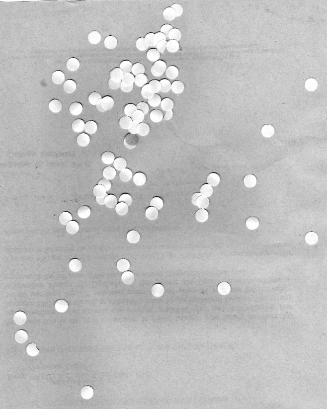
This type of image is usually used because it is easy to process. Though the downside of this format is the lack of image information it contains. Nevertheless, this format proves useful in many processes such as determining object orientation and sorting objects as it travels in a conveyor belt (e.g. pharmaceutical pills).

image info generated through imfinfo():
Filename: C:\Users\user\Documents\AP186\activity 3\binary_img.jpg
FileSize: 58783.
Width: 582.
Height: 585.
BitDepth: 8.
ColorType: grayscale

A binary image is usually stored in memory as a bitmap, a packed array of bits. A 640×480 image requires 37.5 KiB of storage. Because of the small size of the image files, fax machines and document management solutions usually use this format. Example of this image are text, signatures, and line art, the example shown above. The example image was obtained from the internet. Initially its color type is truecolor, so I converted it to black and white and it worked. Though in displaying the colortype in imfinfo(), only grayscale and truecolor are available.

Grayscale images

(Grayscale desc: A grayscale image, as the name implies, is an image that has its color in the scale of gray levels only. The value of each of its pixel contains only intensity information. The gray levels are results of different intensities of black to white or vice versa. This type of image is also pertained as monochromatic. The intensity is expressed as a range of  fractional values from 0 to 1 which is total black to total white respectively.

image info generated through imfinfo():
Filename: C:\Users\user\Documents\AP186\activity 3\grayscale_img.jpg
FileSize: 14481.
Width: 332.
Height: 300.
BitDepth: 8.
ColorType: grayscale

File formats such as PNG and TIFF supports 16-bit grayscale images. One technical application of this type of image is on medical imaging.

Truecolor images

A True color image is the most common type of image.  It supports the three RGB colors which stands for Red, Green and Blue. These three color channels are then combined to create different colors, hues and shade as shown in an image. A truecolor usually has at the least 256 shades of red, green, and blue. By which combining all makes 16,777,216 color variations and almost all can be distinguished by the human eye.

For each pixel, generally one byte is used for each channel while the fourth byte (if present) is being used either as an alpha channel, data, or simply ignored. Byte order is usually either RGB or BGR. Some systems exist with more than 8 bits per channel, and these are often also referred to as truecolor (for example a 48-bit truecolor scanner).

image info generated through imfinfo():
Filename: C:\Users\user\Documents\AP186\activity 3\trueimage.jpg
FileSize: 265624.
Width: 450.
Height: 600.
BitDepth: 8.
ColorType: truecolor

The sample truecolor image shown above is a Cave in Cagayan captured using a digital camera. Image formats such as JPEG, PNG and many more support this type.

Indexed images

These types of images are made to lessen  the memory space occupied on the computer or in memory storage. Instead of the data color being contained directly in the pixel, a separate Color map or Palette is utilized. So there are two data contained in the image: image itself and the palette. The Palette contains an array of colors, each color element having its corresponding index depending on its position in the array. The array contains limited number of color. The usual are 4,  16 and 256. Though this saves memory space it may reduce the color information.

(Small 4- or 16-color palettes are still acceptable for little images or very simple graphics, but to reproduce real life images they become nearly useless.)

image info generated through imfinfo():
Filename: C:\Users\user\Documents\AP186\activity 3\indexed_img.jpg
FileSize: 64993.
Width: 560.
Height: 420.
BitDepth: 8.
ColorType: truecolor

Application of a more complex image processing creates another set of Image types. This new set of types of images also have specific uses.

High Dynamic Range (HDR) images

An HDR image is a result of a digital imaging technique that allows a far greater dynamic range of exposures compared to normal digital imaging techniques. It is usually used in images of scenes, such as fireworks display and shots of the sky, wherein a wide range of intensity levels can be exhibited. This is usually achieved by modifying photos with image processing software for tone-mapping.

Among the image types, I fancy HDR images.  I think it’s the impact the image makes due to the intensity of its colors.

Multispectral/Hyperspectral images

Multispectral imaging deals with several images at discrete and somewhat narrow bands. A multispectral sensor may have many bands covering the spectrum from the visible to the longwave infrared. Multispectral images do not produce the “spectrum” of an object.

On the other hand, Hyperspectral imaging deals with imaging narrow spectral bands over a continuous spectral range, and produce the spectra of all pixels in the scene. So a sensor with only 20 bands can also be hyperspectral when it covers the range from 500 to 700 nm with 20 bands each 10 nm wide.

3-Dimensional (3D) images

a.)  A point cloud is a set of vertices in a three-dimensional coordinate system. These vertices are usually defined by XY, and Zcoordinates, and typically are intended to be representative of the external surface of an object.

Point clouds are most often created by 3D scanners. These devices measure in an automatic way a large number of points on the surface of an object, and often output a point cloud as a data file. The point cloud represents the set of points that the device has measured.

b.) Cross-eye stereoscopic format is the most popular method for showing 3D on a computer screen, because it does not need any equipment.

Stereo pairs are fused without optical aid in two ways, called X (cross eye) and U (parallel). [X] Big images are fused by going cross-eyed until the two pictures superimpose. Converging the eyes makes them focus close, and it is necessary to wait until the brain adjusts the focus for distant viewing again. Suddenly the pictures fuse as a 3D image. It is possible to look around the picture with the eyes locked into the correct format. [U] Small images are seen the same way as in a 3D viewer, using U or parallel vision. The eyes are relaxed to look into the distance until the images fuse, then refocused by the brain.

c.) (2-dimensional) Image Stacking

Many scanning devices, such as MRI, result in slices through an object, each each 2D slice is normally presented as a grey scale image.

Each pixel in the image corresponds to some characteristic at that point in space, for example protein density in MRI or X-ray absorbtion in CT scans. These images stack together to form a solid representation of the head. The contour approach attempts to trace the outline of the chatacteristic of interest and use these contours to form the surface.

Temporal images/videos

A number of temporal images produces a video. This we see in our daily lives almost all the time. In the sample given below, the concept  of Temporal Video is demonstrated. I just thought that this is interesting that’s why I decided to use it as the example. The proponent’s explanation on his idea: ” I remembered slit-scan photography, a method where a slit is moved across the picture plane essentially taking a temporal image, where different times of the scene are captured on different parts of the film.”

If you want to see a more detailed explanation of what the experimenter did, watch the Making of the video here.

Image Formats

In image processing, it is important that one chooses the right format. As technology advances, data storage increases,  thus compressing file storage is needed. There are two types of image file compression algorithms: lossless and lossy.

Lossless compression algorithms reduce file size while preserving a perfect copy of the original uncompressed image. Lossless compression generally, but not exclusively, results in larger files than lossy compression. Lossless compression should be used to avoid accumulating stages of re-compression when editing images.

Lossy compression algorithms preserve a representation of the original uncompressed image that may appear to be a perfect copy, but it is not a perfect copy. Oftentimes lossy compression is able to achieve smaller file sizes than lossless compression. Most lossy compression algorithms allow for variable compression that trades image quality for file size.

Color data mode  -bits per pixel
JPG RGB – 24-bits (8-bit color),
Grayscale – 8-bits
(only these)JPEG always uses lossy JPG compression, but its degree is selectable, for higher quality and larger files, or lower quality and smaller files. JPG is for photo images, and is the worst possible choice for most graphics or text data.
TIF Versatile, many formats supported.
Mode: RGB or CMYK or LAB, and others, almost anything.
8 or 16-bits per color channel, called 8 or 16-bit “color” (24 or 48-bit RGB files).
Grayscale – 8 or 16-bits,
Indexed color – 1 to 8-bits,
Line Art (bilevel)- 1-bitFor TIF files, most programs allow either no compression or LZW compression (LZW is lossless, but is less effective for color images). Adobe Photoshop also provides JPG or ZIP compression in TIF files too (but which greatly reduces third party compatibility of TIF files). “Document programs” allow ITCC G3 or G4 compression for 1-bit text (Fax is G3 or G4 TIF files), which is lossless and tremendously effective (small). Many specialized image file types (like camera RAW files) are TIF file format, but using special proprietary data tags.

Another criteria in choosing the file formats are mainly due to its usage or purpose.

Best file types for these general purposes:

Photographic Images Graphics, including
Logos or Line art 
Properties Photos are continuous tones, 24-bit color or 8-bit Gray, no text, few lines and edges Graphics are often solid colors, with few colors, up to 256 colors, with text or lines and sharp edges
For Unquestionable Best Quality TIF or PNG (lossless compression
and no JPG artifacts)
PNG or TIF (lossless compression,
and no JPG artifacts)
Smallest File Size JPG with a higher Quality factor can be decent. TIF LZW or GIF or PNG   (graphics/logos without gradients normally permit indexed color of 2 to 16 colors for smallest file size)
Maximum Compatibility
(PC, Mac, Unix)
TIF or JPG TIF or GIF
Worst Choice 256 color GIF is very limited color, and is a larger file than 24 -bit JPG JPG compression adds artifacts, smears text and lines and edges

Other Image formats are as given below

JPEG 2000

JPEG 2000 is a compression standard enabling both lossless and lossy storage. The compression methods used are different from the ones in standard JFIF/JPEG; they improve quality and compression ratios, but also require more computational power to process. JPEG 2000 also adds features that are missing in JPEG. It is not nearly as common as JPEG, but it is used currently in professional movie editing and distribution (e.g., some digital cinemas use JPEG 2000 for individual movie frames).

Exif

The Exif (Exchangeable image file format) format is a file standard similar to the JFIF format with TIFF extensions; it is incorporated in the JPEG-writing software used in most cameras. Its purpose is to record and to standardize the exchange of images with image metadata between digital cameras and editing and viewing software. The metadata are recorded for individual images and include such things as camera settings, time and date, shutter speed, exposure, image size, compression, name of camera, color information. When images are viewed or edited by image editing software, all of this image information can be displayed. It stores meta informations.

RAW

RAW refers to a family of raw image formats that are options available on some digital cameras. These formats usually use a lossless or nearly-lossless compression, and produce file sizes much smaller than the TIFF formats of full-size processed images from the same cameras. Although there is a standard raw image format, (ISO 12234-2, TIFF/EP), the raw formats used by most cameras are not standardized or documented, and differ among camera manufacturers.

BMP

The BMP file format (Windows bitmap) handles graphics files within the Microsoft Windows OS. Typically, BMP files are uncompressed, hence they are large; the advantage is their simplicity and wide acceptance in Windows programs.

PPM, PGM, PBM, PNM

Netpbm format is a family including the portable pixmap file format (PPM), the portable graymap file format (PGM) and the portable bitmap file format (PBM). These are either pureASCII files or raw binary files with an ASCII header that provide very basic functionality and serve as a lowest-common-denominator for converting pixmap, graymap, or bitmap files between different platforms. Several applications refer to them collectively as PNM format (Portable Any Map).

Now, some applications of what I learned in Scilab and the research done in Image file types and formats. 🙂

I used the Scilab and the newer version of SIP toolbox which is the SIVP toolbox.

First, I obtained an image, captured using a Canon Digital camera, archived in my computer. This is a truecolor image.

stacksize(10000000);
I = imread('C:\Users\user\Documents\AP186\activity 3\tru_image4.jpg');
size(I)

Converting the truecolor image to grayscale is done by using the rgb2gray() function.

I2 = rgb2gray(I);
imshow(I2);
imwrite(I2, 'tru_image4_gray.png')

Then converting the truecolor to black and white, the im2bw() function is utilized. But then, aside from the image to be converted, a threshold value is required. The threshold  value determines the pixel that qualifies as 0 (white) or1 (black). Basically it sorts out the pixel as black or white. I placed a value that I thought produces the best B&W image.

I3 = im2bw(I,0.3);
imshow(I3);
imwrite(I3,'tru_image4_bw.png')

In converting the image to black and white, the goal is also to separate the foreground from the background. A more efficient way of doing this is by obtaining the histogram of gray levels of the grayscale version of the truecolor image. To demonstrate , I used the hand-drawn plot image from the first activity.

The image was first converted to grayscale using rgb2gray(). If your using SIP toolbox, there’s a straightforward function that simultaneously reads an image and converts it to gray scale: the gray_imread(). But since I’m using the SIVP toolbox and there’s no counterpart function for that, the rgb2gray() will do.

J = imread('C:\Users\user\Documents\AP186\activity 3\p1.jpg');
J1 = rgb2gray(J);
imshow(J1);
 

I obtained the histogram of the grayscale image but it was too concentrated in the right part of the graph. But a better plot that shows the gray levels is by plotting the cells vs count as shown in the code below. Zooming in the lower part displays a clearer distribution.

[count, cells]=imhist(J1);
imwrite(J2,'p1_gray_hist.png')
J2 = im2bw(J,0.75);
imshow(J2);

From this, I decided on using on the average a threshold value of 0.75 . And the resulting black and white image is shown below.


Learning and playing with the different types, formats and properties of images is really fun though somewhat exhausting. 🙂

For this activity I give myself a 10. 🙂

References:

binary desc: http://en.wikipedia.org/wiki/Binary_image

binary image: http://xaomi.deviantart.com/art/Line-art-73599773

grayscale desc: http://en.wikipedia.org/wiki/Grayscale

grayscale image: http://www.codeproject.com/Articles/33838/Image-Processing-using-C

indexed image : http://blogs.mathworks.com/steve/2006/02/03/all-about-pixel-colors-part-2/

hdr image: http://www.smashingmagazine.com/2008/03/10/35-fantastic-hdr-pictures/

multi/hyperspectral: http://en.wikipedia.org/wiki/File:MultispectralComparedToHyperspectral.jpg

3d image:

 pointcloud:http://www.severnpartnership.com/case_studies/architectural_measured_building_survey_bim/harper_adams_university_campus_buildings

stereopair:http://www.flickr.com/photos/kiwizone/1645102785/sizes/m/in/set-72157602440689327/

mri: http://paulbourke.net/miscellaneous/cortex

image formats: http://www.scantips.com/basics09.html

Activity 2: Scilab Basics

For the second activity, we were required to use the Scilab program. For this class we will be using the Scilab version 5.3.3. Since I still don’t have it in my computer I still have to install it. Good thing my classmate already had downloaded from Scilab.org ( since it’s freely downloadable 🙂 ). So all i had to do is ask a copy and  install it in my computer.   But then I had a problem figuring out how to install the SIVP toolbox. We (me and my classmates who have 64-bit computers) found out that the toolbox can just be simply found in the toolbox drop menu at the top part of the Scilab console. After fixing that up, we are ready to learn the Scilab basics.

Figure 1. SIVP in Toolboxes menu

To start off, a sample code was given in the manual of the activity. It’s a code for generating a circular aperture. It’s basically a circle located at the center of a square. The circular aperture generated is shown below.

Figure 2. Circular aperture image

And the free code is as shown below.

Figure 3. Circular aperture code

Beside the codes/line are comments which explains its function. Essentially, a zero matrix A was made. Then a variable r was defined as the radius. Mapping the values of r less than 1 form matrix A, a white circle is formed. The imshow() function then displayed the image.

Figure 4. Annulus code

It’s now time to generate figures on my own. First image that I did is the annulus. Since essentially it looks the same as the circular aperture, it’s code is just similar as the circle as shown it the code snippet above. The only difference is the condition in the mapping part of the code (line 7) is set such that only the values within the radius 0.5 and 0.7 is obtained to form the annulus part. The annulus figure generated is shown below.

Figure 5. The Annulus image

Next figure is the square aperture. Again, the initial part of the code, shown below, is the same. But the condition for mapping doesn’t make use of the radius since it’s a square aperture. So the condition used in generating the aperture (refer to line 7) is the any absolute value of X and Y that are less than the given value (in my case I used 0.3).

Figure 6. Square aperture code

From the code, the square aperture image below is generated. 🙂

Figure 7. The Square aperture image

Next up is the Corrugated roof. Below is the code made. In this part, a variable B is introduced. It is a matrix made by taking the sine of  matrix Y to form the shape of the surface.

Figure 8. The Corrugated roof code

This surface shape takes the form of the Corrugated roof. The 2- dimensional image below is the generated image form the code.

Figure 9. The Corrugated roof image (2D)

In contrast  to the imshow() function that’s been used in the other codes, there is another function that generates the figure  but in 3-dimension.

Figure 10. The Corrugated roof code (3D)

Changing the imshow() to mesh() as shown in the code above, the 3-dimensional image shown below is generated. From this we see that it is indeed a corrugated roof.

Figure 11. The corrugated roof (3D)

For the fifth image, we have the Grating. A sine wave function was used. It was set such that the (+) y values is set to 1 and the  (-) y values is set to 0. It then results to alternating black and white stripes. The code snippet for the image is shown below.

Figure 12. The Grating code

The grating image is shown below.

Figure 13. The Grating image

Lastly, a Gaussian bell distribution image was generated. The code is given below. In this code, a sigma variable was introduced which determines the spread of the bell. Then A was set to be equal to the Gaussian function. The values for r was then mapped for values greater than 0.7.

Figure 14. The Gaussian Bell Curve code

And the Gaussian Bell (2D) is generated as shown below.

Figure 15. The Gaussian Bell image (2D)

At first it was hard trying to figure out how to manipulate the code so that I’d be able to obtain the desired image. But after a while, I already had the grasp on the basics of  how to program in Scilab and it turned out to be fun. Being able to generate any desired image is a good tool and will be very useful  in research .

 I have understood at least some of the basics in Scilab necessary to accomplish the tasks given in the activity. For this activity, I give myself a 10.0.

I would like to thank Sheryl, Zaldy and Mabel for helping me understand how to do the activity. 🙂

Previous Older Entries